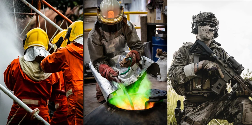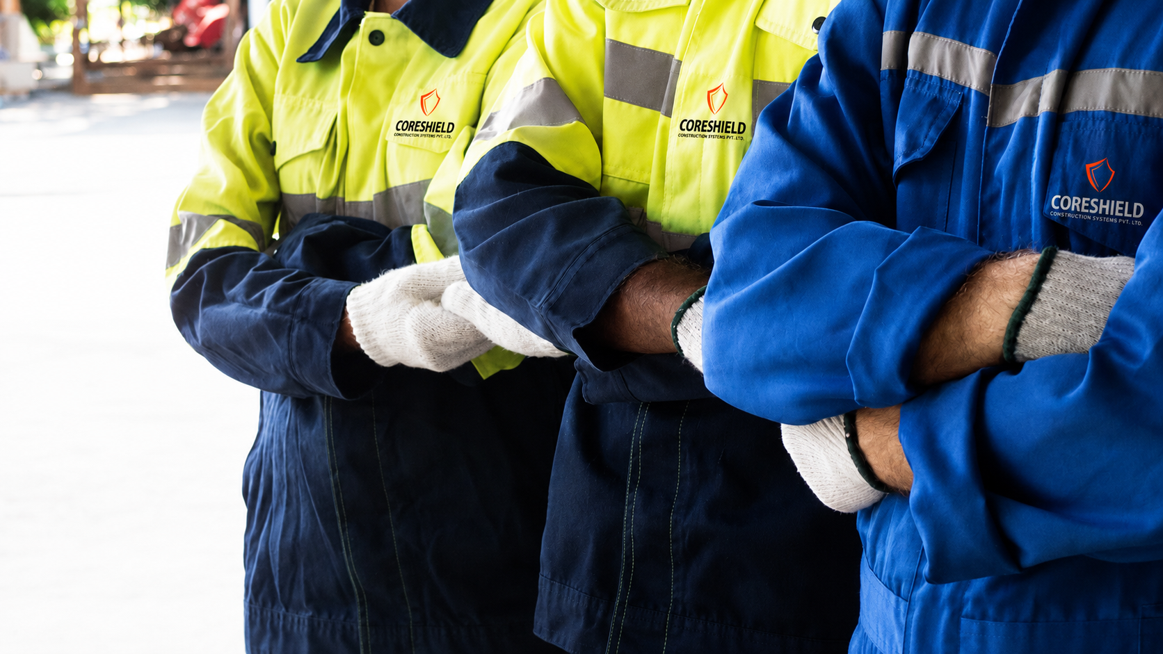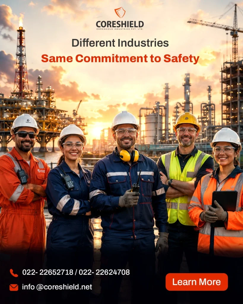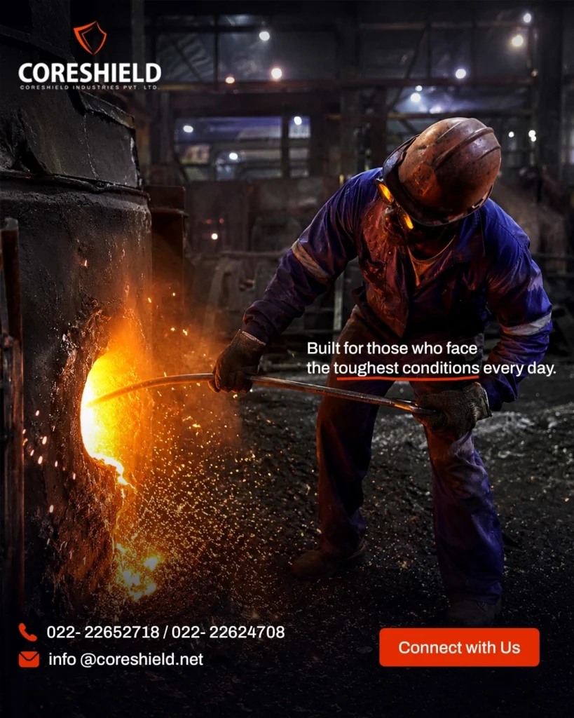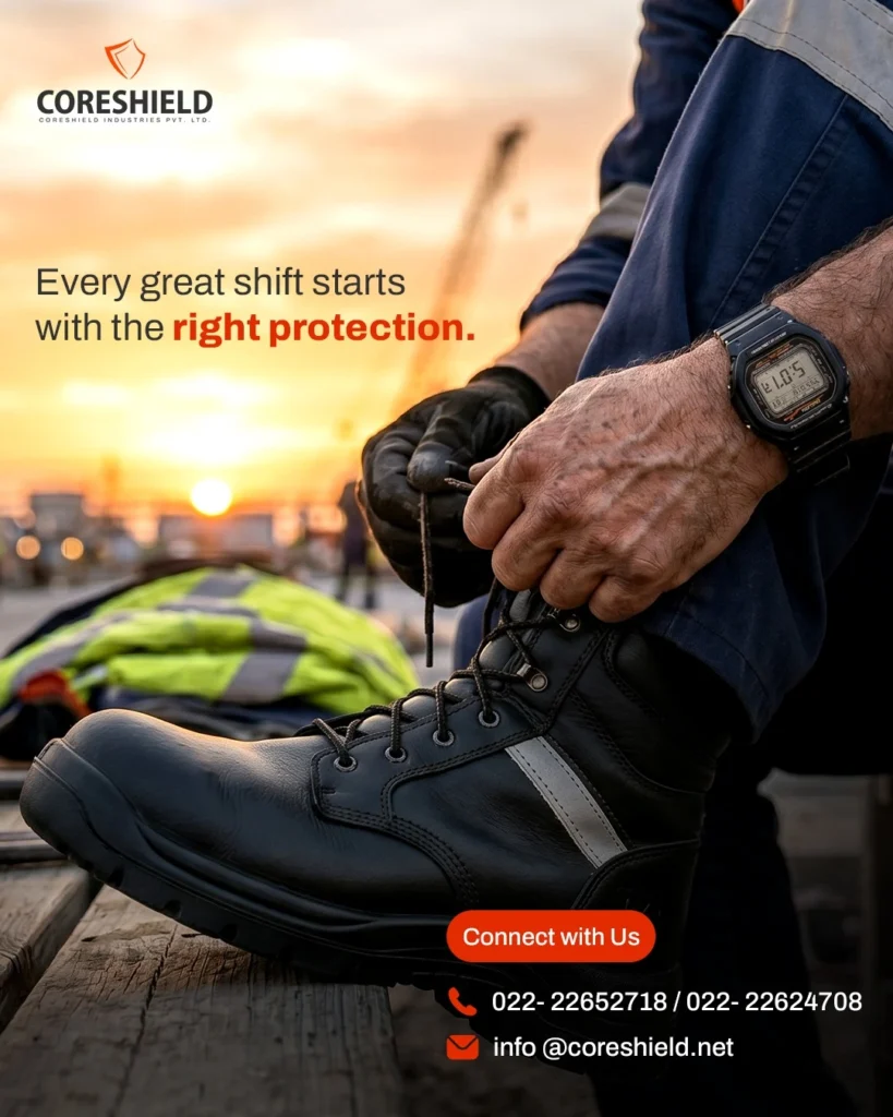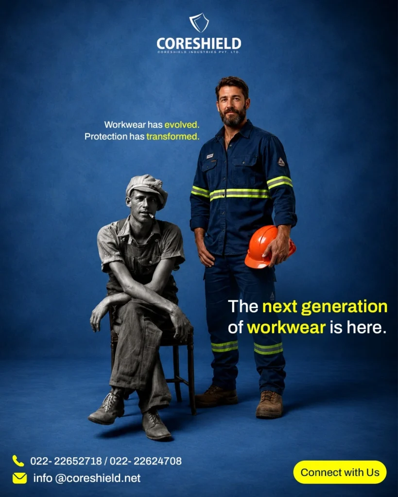


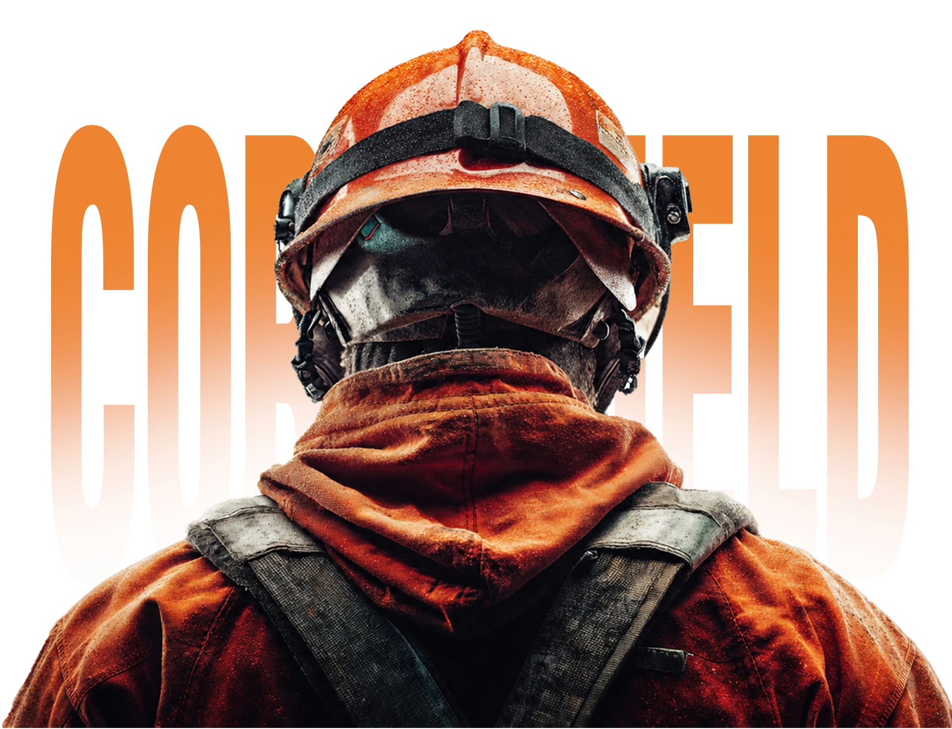
CORESHIELD is a prominent manufactures, suppliers and exporters of industrial and Corporate Work Wear, FR Coveralls and Industrial Safety Footwear. Their exclusive range includes Fire Fighting Suits, Flame Retardent Coveralls, Industrial Work Uniforms, Critical Condition Work Wears etc.
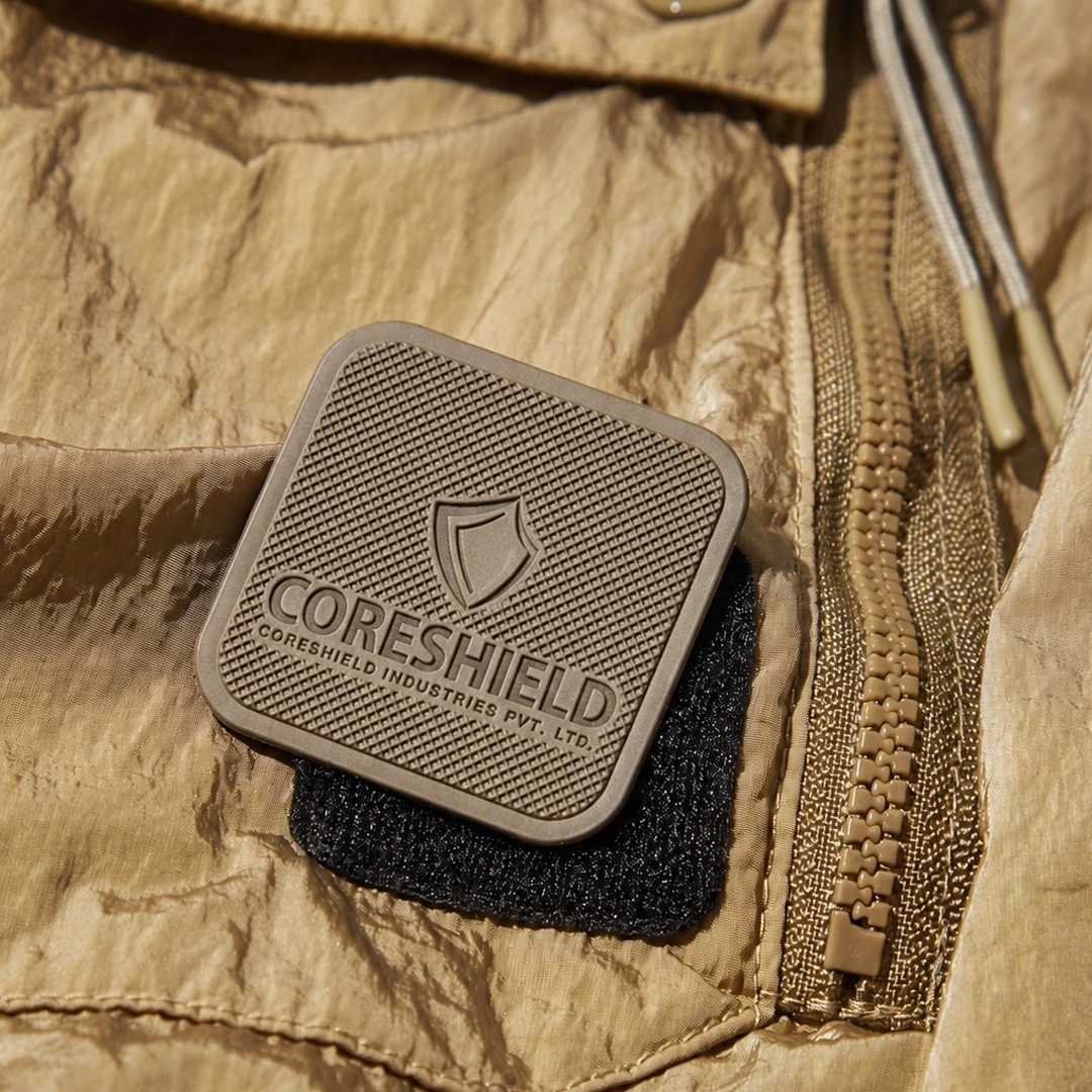
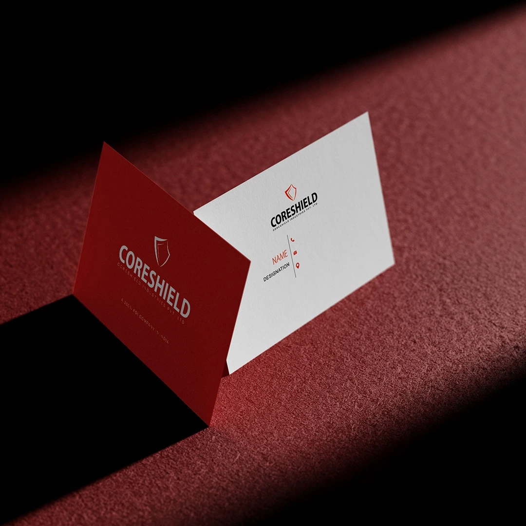
CORESHIELD needed more than a logo- it required a strategic brand identity that conveyed protection, innovation and industrial expertise. The goal was to create a scalable visual system that strengthened market presence, built brand recognition and established a consistent identity across every touchpoint.
Built around the idea strength through protection, the identity translates CORESHIELD’s purpose into a bold, modern typography to color and brand assets- was designed to create a consistent, trustworthy presence across all brand touchpoints.
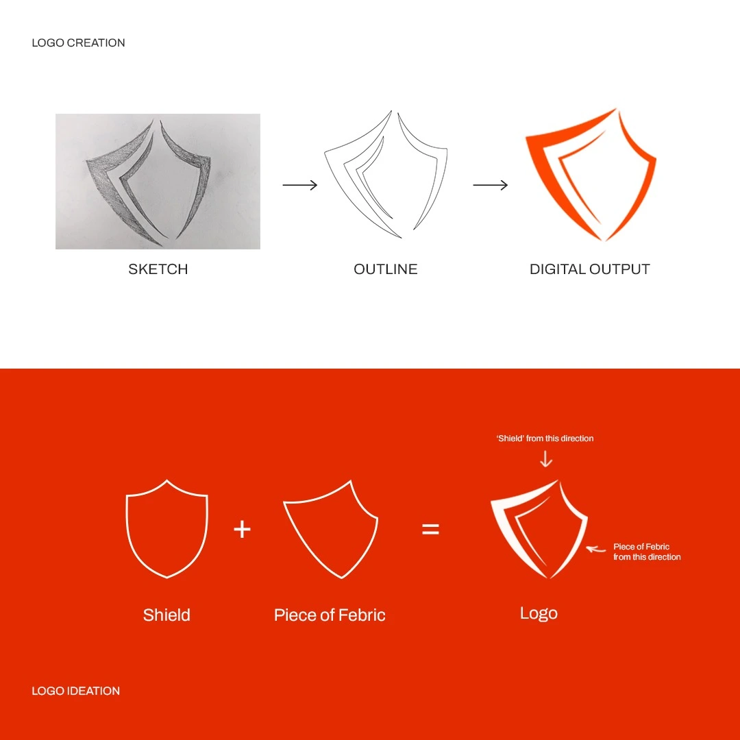
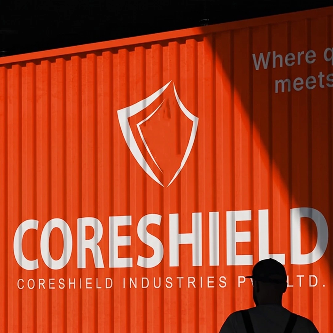
The CORESHIELD logo combines the symbolism of a shield and protective fabric to represent safety, strength and innovation. The shield reflects the brand’s commitment to protecting workers, while the fabric-inspired element highlights expertise in high performance protective workwear. Together, they create a distinctive identity that communicates trust, durability and reliability.